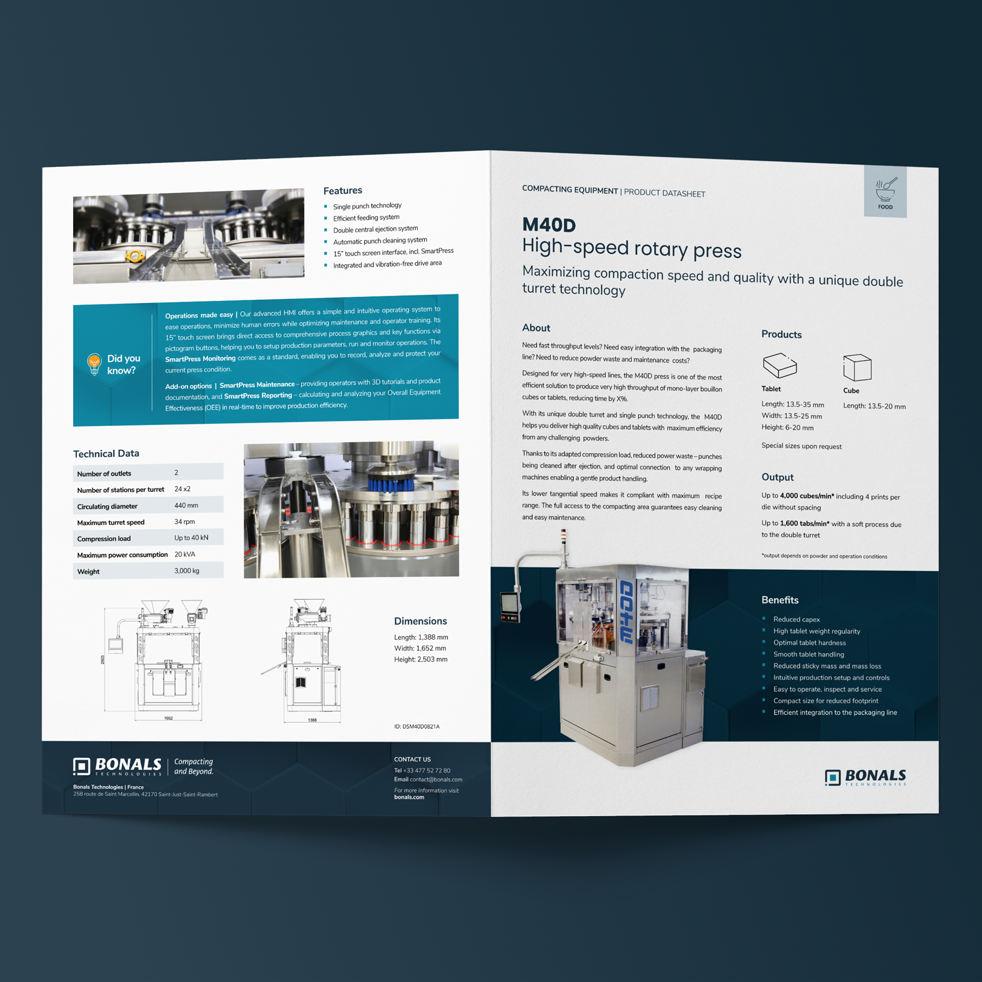
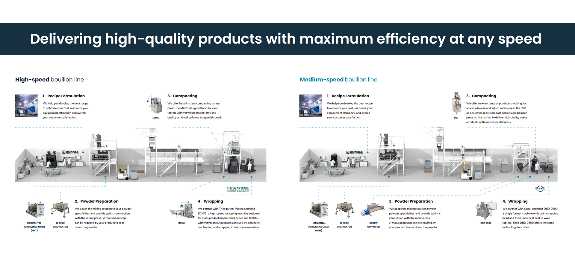
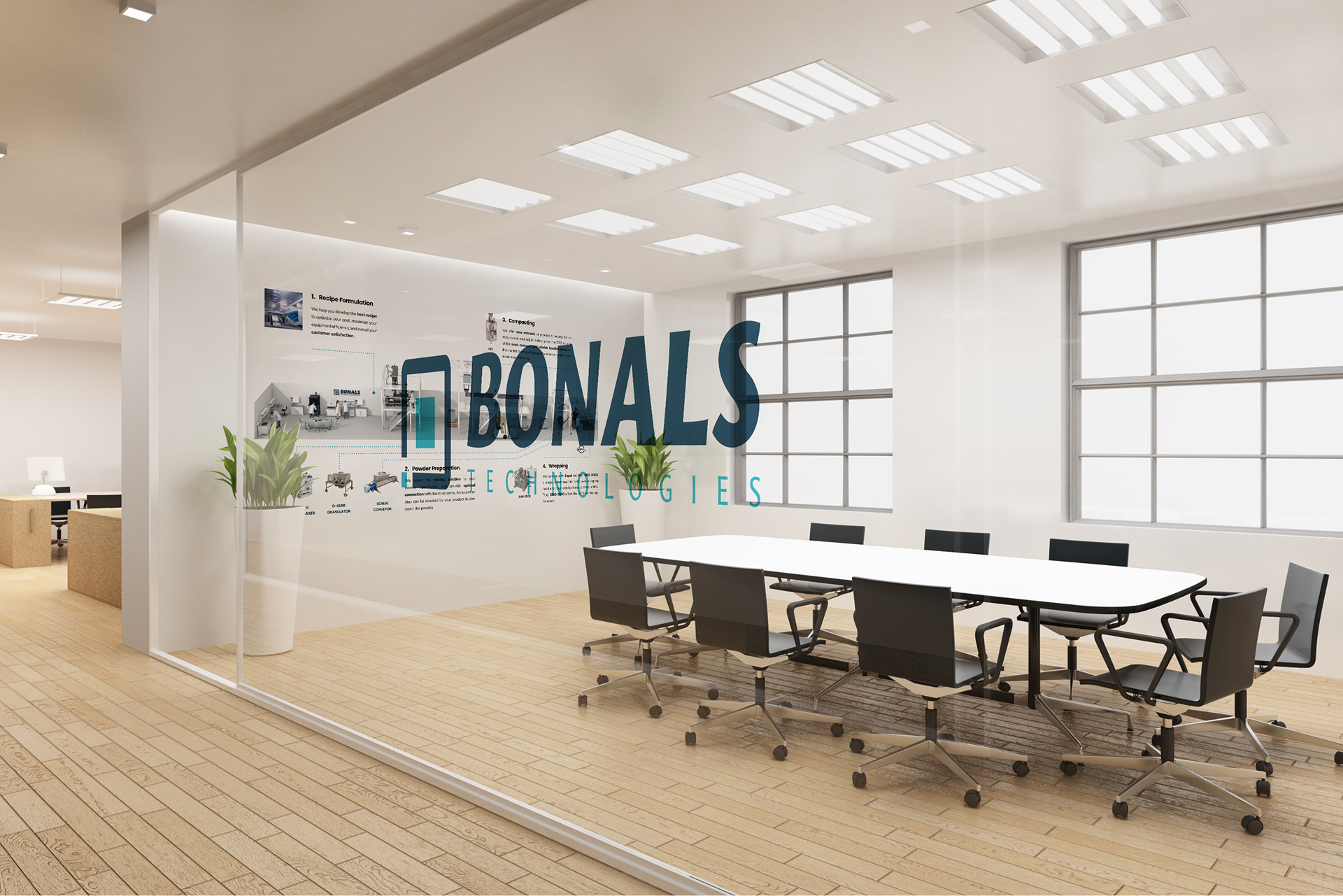
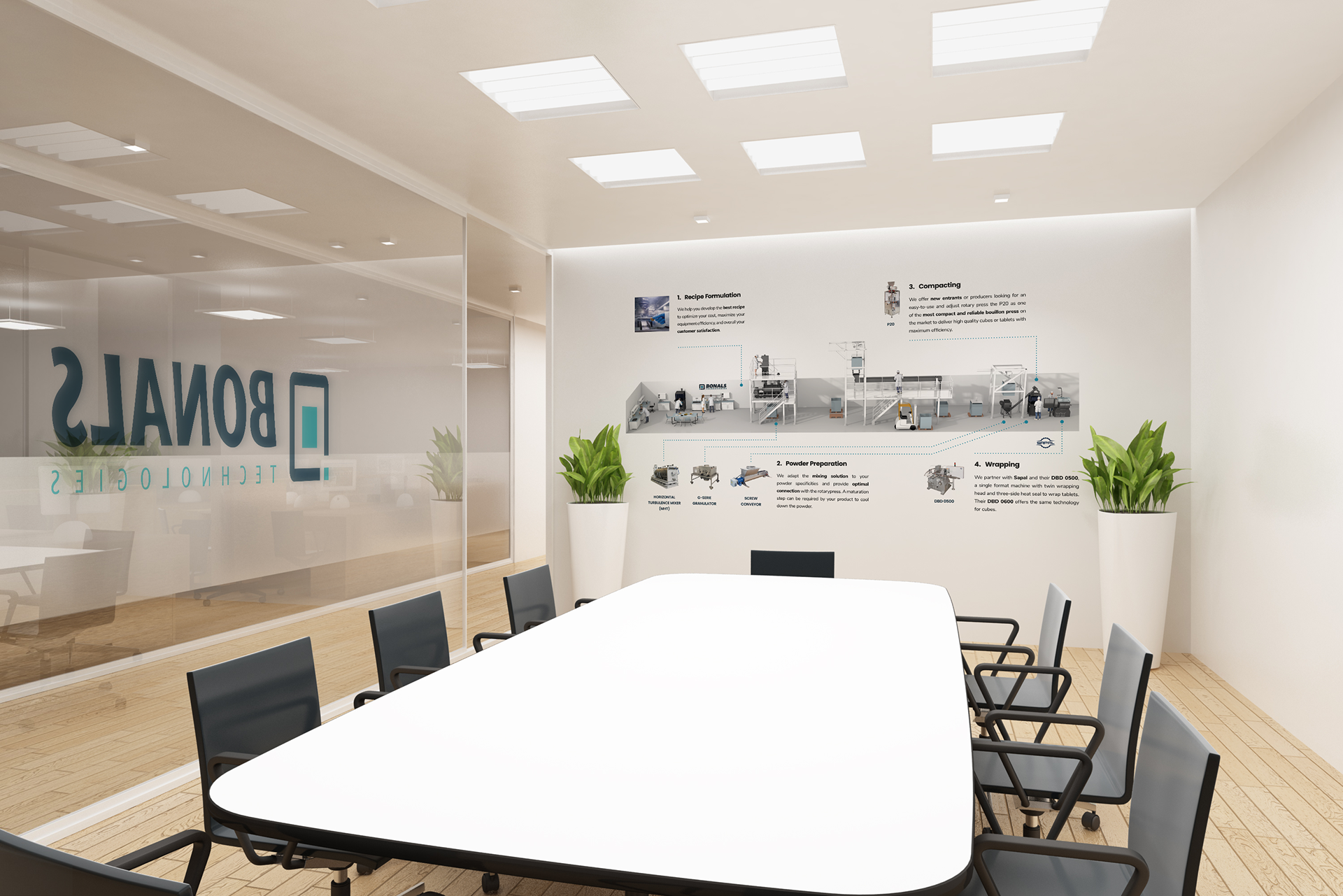
For Bonals, I led the complete redesign of the brand, developing a fresh visual identity that better reflected their values and market positioning. I crafted a new logo, defined a cohesive color palette and typography system, and redesigned all core communication materials.

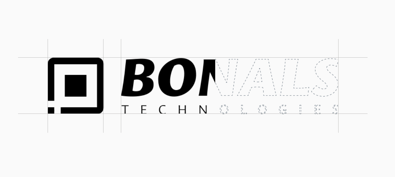
Evolution of the J.Bonals logo
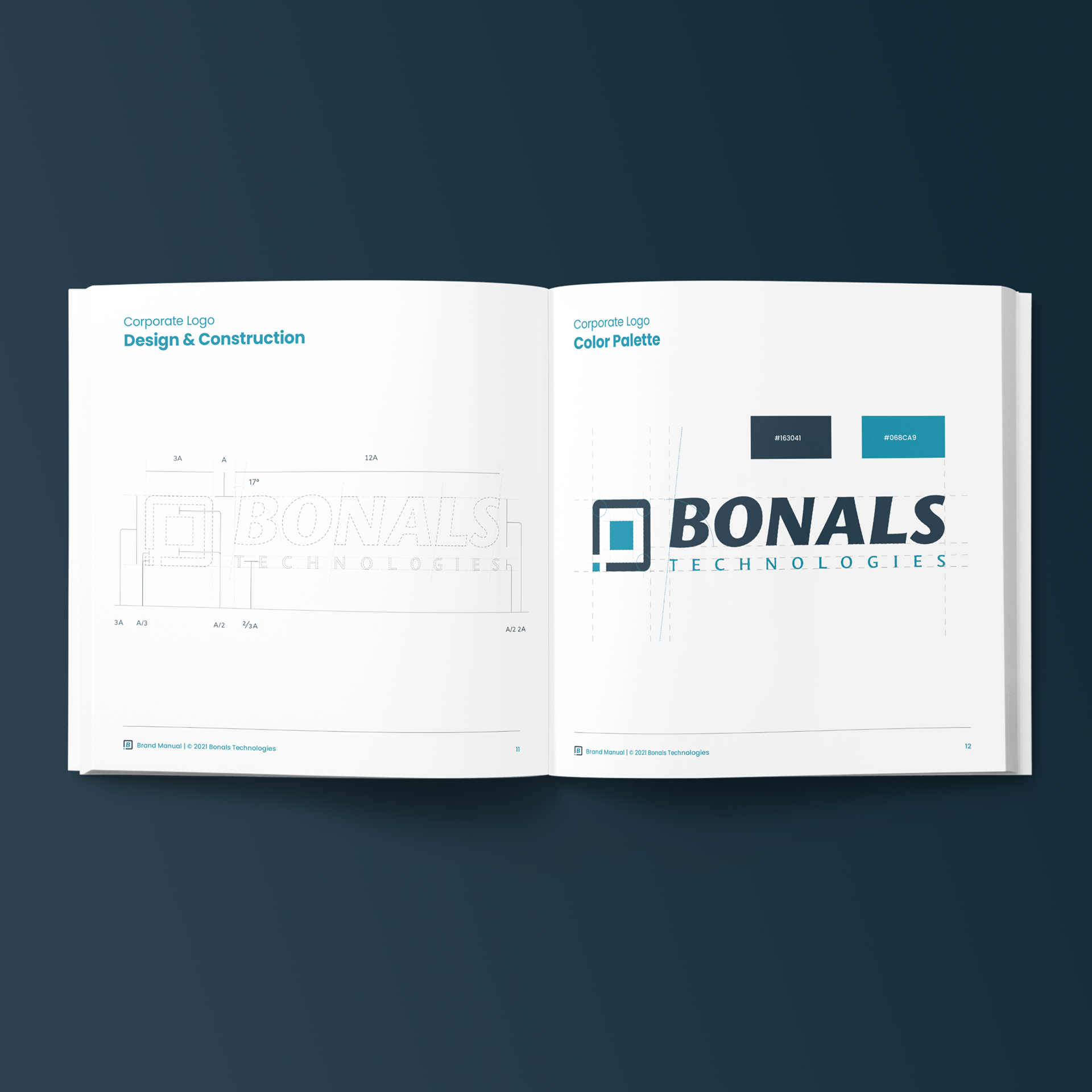
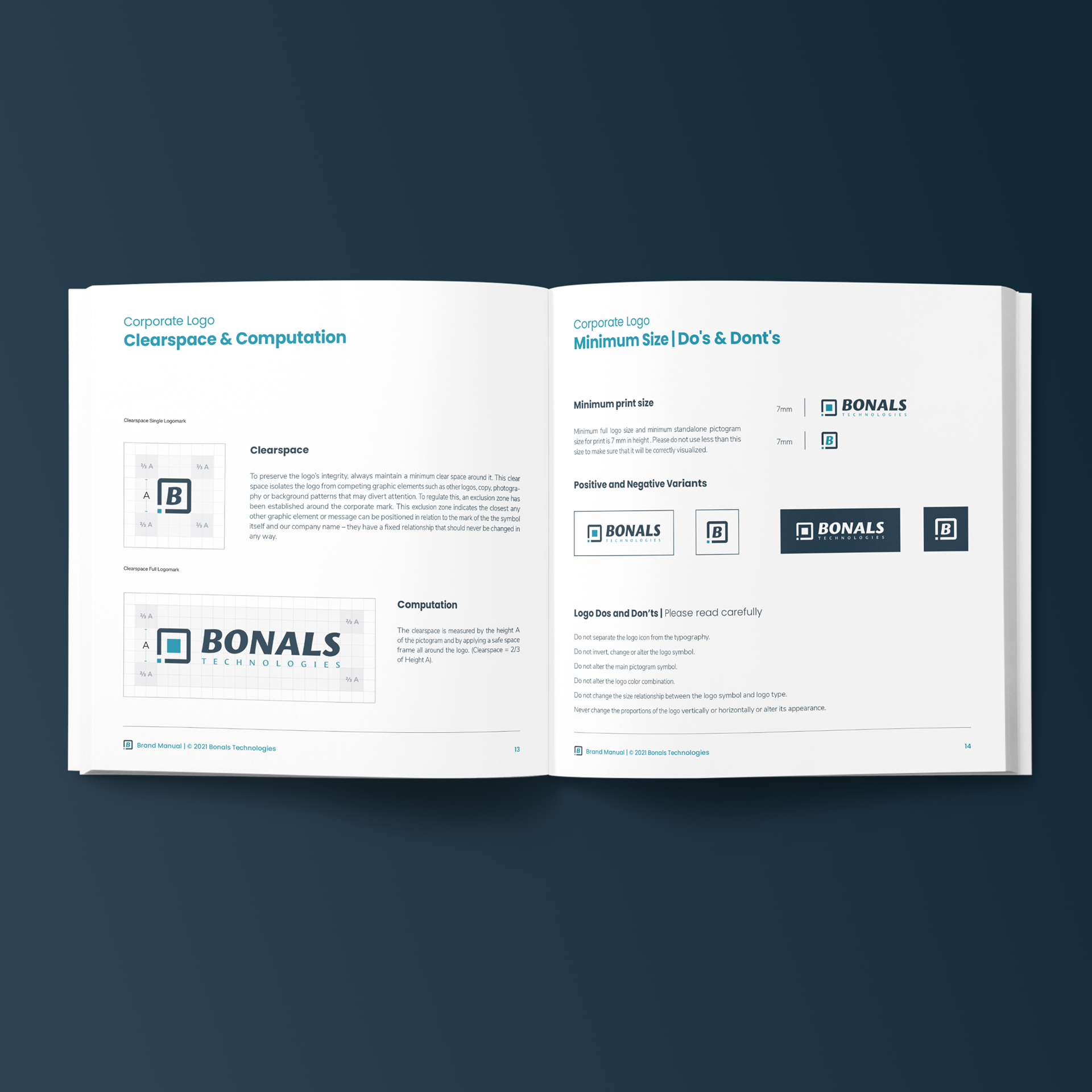
As part of this transformation, we reimagined the brand identity — carefully deconstructing the former Eurotab-Bonals mark while honoring the legacy of founder J. Bonals. The new logo pays tribute to the brand’s historical DNA through its fundamental shapes and angular forms, now reinterpreted to signal a forward-looking, independent Bonals Technologies.
Concept

Just like color, shape has an immediate and lasting impact. It influences how a brand is perceived and remembered. For Bonals Technologies, the use of geometric shapes—specifically rectangular, cubic, or tablet-inspired forms—creates a logical visual connection to the company’s name, heritage, and industrial context.
These shapes are intentionally embedded into the logo layout, used as framing devices, or applied as decorative elements throughout the identity system.
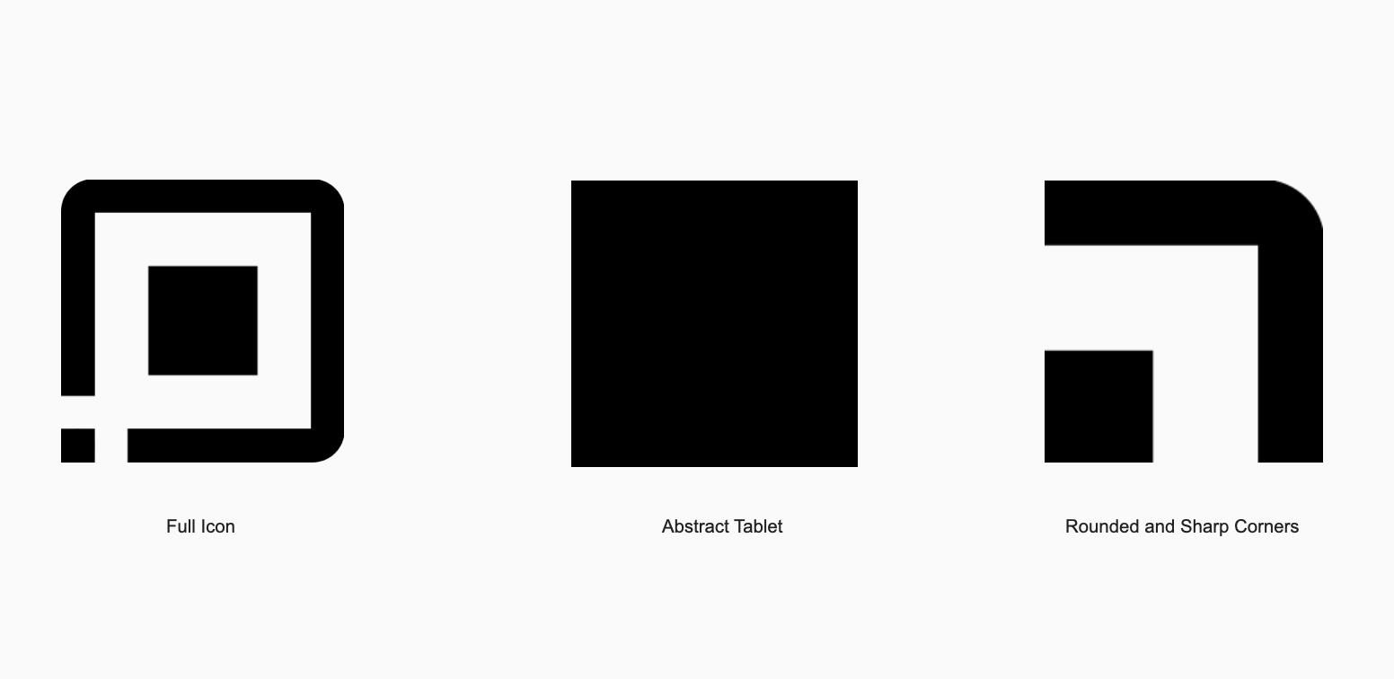
To strike the right visual balance, the logotype combines sharp corners with rounded letterforms. This contrast enhances memorability while reinforcing the brand’s dual nature: precision and innovation, tempered by approachability and human focus.
Rounded forms evoke comfort and positive emotional response, while sharp edges draw attention, create tension, and invite visual interaction — together delivering a dynamic yet grounded identity.


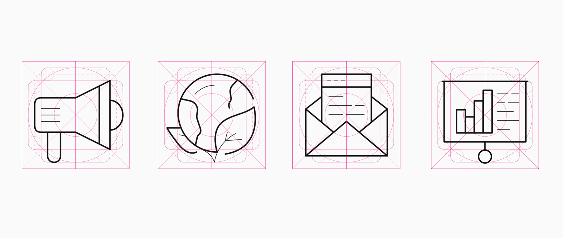
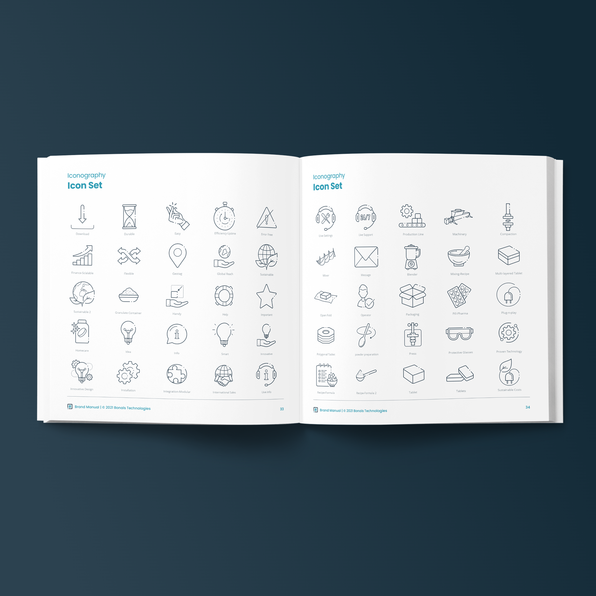
Icon design
Dubai Gulfood Expo 2021 - Spain Pavillion


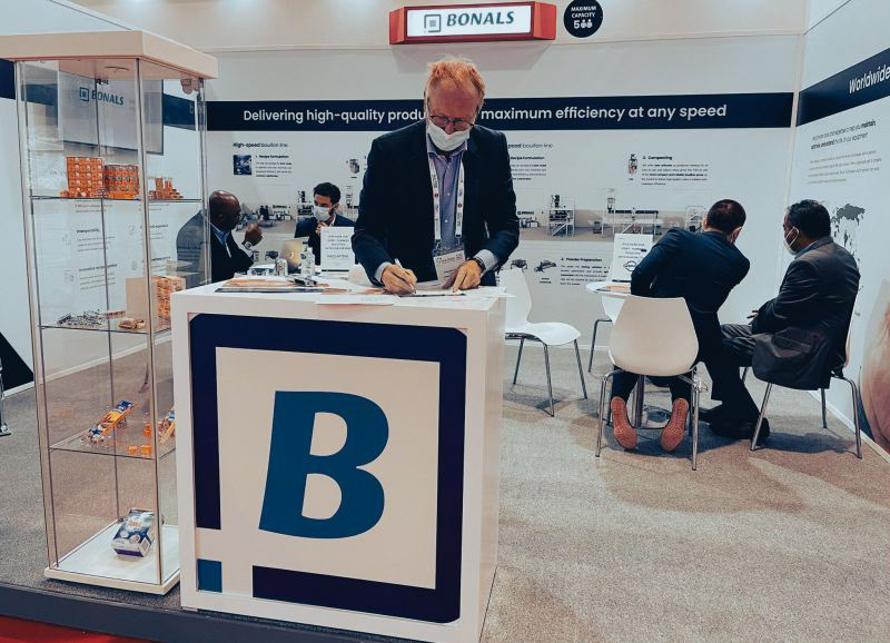
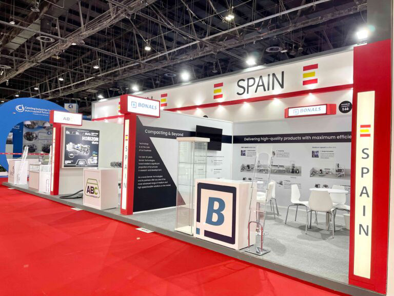
Dubai Gulfood Expo 2021 - Spain Pavillion - Bonals Stand
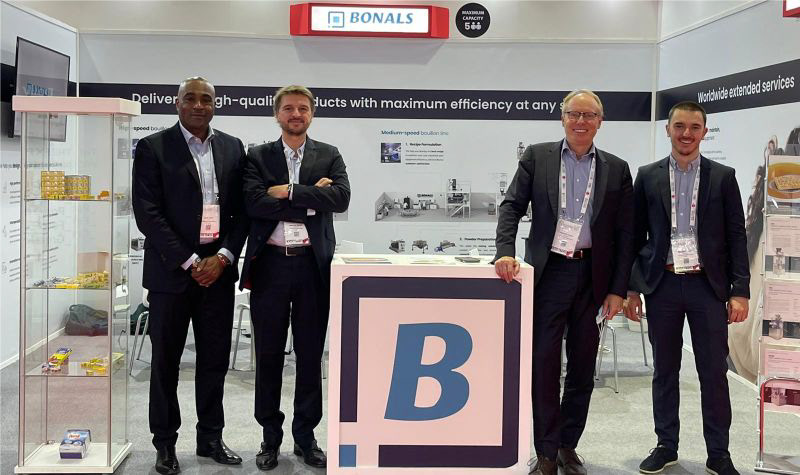
Dubai Gulfood Expo 2021 - Spain Pavillion - Bonals Stand
Dubai Gulfood Expo 2021 - Spain Pavillion - Bonals Stand
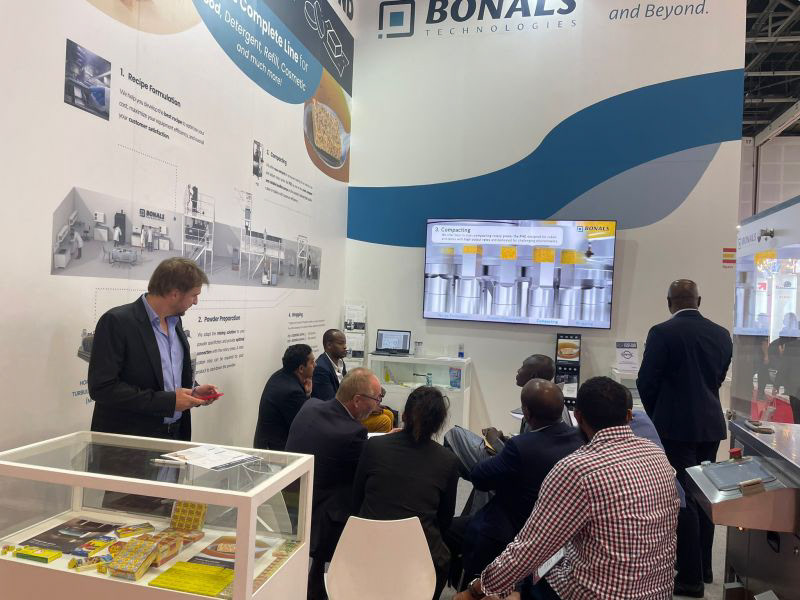
Dubai Gulfood Expo 2022 - Spain Pavillion - Bonals Stand
Dubai Gulfood Expo 2021 - Spain Pavillion - Bonals Stand